Mobile first website design is no longer optional for local businesses. Over 60% of local searches happen on smartphones, and Google now indexes and ranks the mobile version of your website before the desktop version. If your site looks great on a laptop but falls apart on a phone, you are losing customers and rankings simultaneously.
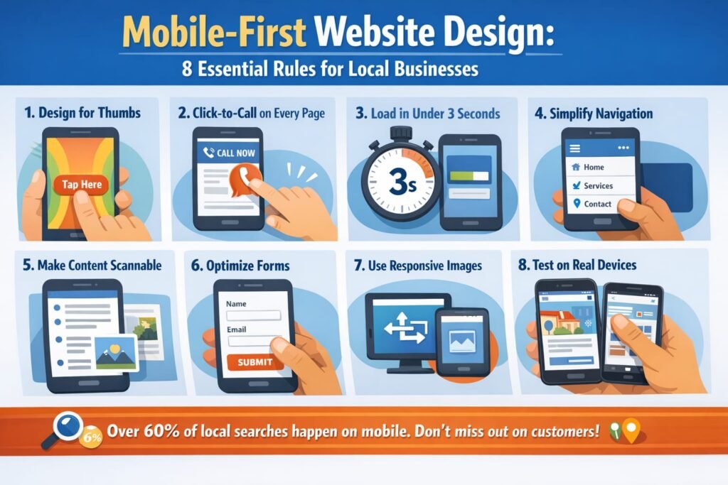
Here are 8 essential rules for mobile first website design that every Bay Area business needs to follow.
Rule 1: Design for Thumbs, Not Mice
The most fundamental shift in mobile first website design is understanding how people interact with small screens. They tap with thumbs, not click with precise mouse cursors.
Buttons need to be at least 44×44 pixels. Navigation links need generous spacing so users don’t accidentally tap the wrong one. Your primary call-to-action should sit in the thumb-friendly zone, the lower center of the screen where thumbs naturally rest.
Forms should use appropriate input types. Email fields should trigger the email keyboard. Phone fields should trigger the number pad. Every unnecessary keystroke on mobile is friction that costs you conversions.
Rule 2: Click-to-Call on Every Page
For local businesses, a phone call is often the highest-value conversion. Mobile first website design demands a click-to-call button visible on every single page.
Place your phone number in the header as a tappable link. Add a sticky call button that follows users as they scroll. Make the phone number large enough to read and tap without zooming.
According to Google, 70% of mobile searchers call a business directly from search results. If they land on your website instead, make that call button impossible to miss.
Rule 3: Load in Under 3 Seconds on Cellular
Desktop speed tests don’t tell the full story. Mobile first website design must account for cellular connections, which are significantly slower than WiFi.
Test your site on a real phone using a cellular connection, not your office WiFi. Google’s PageSpeed Insights tests mobile performance specifically. Aim for a mobile score above 80.
The biggest mobile speed killers: uncompressed images, too many fonts, excessive JavaScript, and cheap shared hosting. Fix these and most local business websites drop from 6 to 8 seconds down to under 3. Read our guide on how website speed affects your ranking.
Rule 4: Simplify Your Navigation
Desktop menus with 8 to 12 items and dropdown submenus become unusable on mobile. Mobile first website design requires a simplified navigation structure.
Use a hamburger menu with 5 to 7 primary items maximum. Put your most important pages first: Services, Contact, About. Add a prominent CTA button in the mobile menu itself.
Consider sticky navigation that stays accessible as users scroll. The goal is zero confusion: at any point on your mobile site, users should know exactly how to find what they need or contact you.
Rule 5: Make Content Scannable
Nobody reads walls of text on a phone. Mobile first website design requires content structured for scanning.
Use short paragraphs of 1 to 3 sentences maximum. Break content with subheadings every 2 to 3 paragraphs. Use bold text to highlight key points. Include visual breaks like images, icons, or dividers.
Your most important information should appear above the fold on mobile, meaning visible without scrolling. For local businesses, that means your service description, location, and contact method should be immediately visible.
Rule 6: Optimize Forms for Mobile
Long contact forms kill mobile conversions. If your contact form has more than 4 to 5 fields on mobile, you are losing leads.
For mobile first website design, reduce forms to the absolute essentials: name, phone or email, and a brief message. Use large input fields with plenty of padding. Enable autofill so browsers can populate known information.
Consider offering alternatives to forms entirely. A click-to-call button, a text-us option, or a simple “Request a Callback” button with just a phone number field often converts better than a traditional form on mobile.
Rule 7: Use Responsive Images
Images sized for desktop displays waste bandwidth and slow load times on mobile. Proper mobile first website design serves appropriately sized images to each device.
Use responsive image techniques that deliver smaller files to mobile devices. Convert images to WebP format for 25 to 35% file size reduction. Implement lazy loading so images below the fold only load when users scroll to them.
For local businesses, this is especially important for portfolio pages, food photography galleries, and before-and-after showcases where image-heavy content can make mobile load times painfully slow.
Rule 8: Test on Real Devices
Browser developer tools simulate mobile but miss real-world issues. True mobile first website design testing requires real devices.
Test on at least an iPhone and an Android phone. Check both portrait and landscape orientations. Test on cellular data, not WiFi. Try completing your most important conversion action, whether that is calling, filling out a form, or booking an appointment.
Use Google’s Mobile-Friendly Test as a baseline, but supplement with real device testing. What looks fine in a simulator can be frustrating on an actual phone.
Our website optimization service includes comprehensive mobile testing and optimization to ensure your site converts on every device. Get a free mobile audit to see how your site performs.
Frequently Asked Questions
What does mobile first website design actually mean?
It means designing the mobile version of your website first, then scaling up for larger screens. This is the opposite of the traditional approach of designing for desktop and then shrinking it down. Google now uses mobile-first indexing, meaning the mobile version determines your search ranking.
How do I know if my website is mobile-friendly?
Use Google’s Mobile-Friendly Test tool. Also check your PageSpeed Insights mobile score. If your mobile score is below 50 or the test flags usability issues, your site needs mobile optimization.
Will redesigning for mobile affect my SEO rankings?
Improving mobile experience typically boosts SEO rankings since Google prioritizes mobile-friendly sites. Just ensure URLs stay the same and redirects are properly implemented during any redesign.
How much does mobile optimization cost?
For existing websites, mobile optimization typically ranges from $500 to $3,000 depending on the scope of changes needed. Some sites need minor fixes while others require a complete responsive redesign.